Showing posts with label Inspect Element. Show all posts

Wednesday, 29 March 2017

Make Radio Group look like UT Buttons

It's pretty easy to convert links in APEX reports to use the Universal Theme button look & feel, as I described here

http://www.grassroots-oracle.com/2015/12/tutorial-include-action-button-in-report.html

We can apply the same technique to radio groups, but it requires a little more work than just adding some classes, but nothing like jQuery mobile radio fiddles.

It took me a few goes to get the correct string in the correct APEX attribute to make the individual buttons look & behave the way I imagined, so I thought I'd share the journey. Show my working, so to speak.

First, create a radio item:

A humble radio group

Then set 'Option HTML attributes' to add template option classes, just like I did for the report action buttons. This applies the string to each option, rather than the entire item.

class="t-Button t-Button--simple"

If we check the page, the radio group should have button boxes surrounding the text labels.

Radio group with button class


To work out what CSS selector I needed to hide those radio buttons, I used Chrome's Inspect element tool (right click a radio button) so I can see how the HTML is constructed.

Inspect Element is the best browser tool. The best.

One shared property for each item is how the input tag has type=radio.
Further up you can see the entire fieldset as an id of P47_RADIO, our item.
Combine these to identify any radio buttons within this specific item.

Edit page 'Inline CSS' to using this combined CSS selector, with a property to hide any web component identified with that selector.

#P47_RADIO input[type=radio] {
  visibility:hidden; 
  position:absolute;
}

Edit: Commenter Yol had success with visibility:hidden instead of display:none, when it comes to submitting the values. This may be a browser dependent issue.
Hence I have also set position:absolute to ensure the radio buttons don't take up space, as per visibility attribute definition.


This tidies the button group, trouble is,  the current selection is unknown without the native radio button. This can be solved by creating a dynamic action that toggles button classes upon click of each radio item.

Create dynamic action on click of jQuery selector

#P47_RADIO span.t-Button

Add action to Execute JavaScript
// add simple class to all options
$('#P47_RADIO span.t-Button').addClass('t-Button--simple');
// remove from current selection
$(this.triggeringElement).removeClass('t-Button--simple');
// Ensure underlying radio selected
$(this.triggeringElement).prev().click();
The result:


Edit 2: I found that clicking in the green padding area did not change the radio selection, only when I clicked in the blue label. So I added the third line in the JavaScript to ensure the input value simulates the click event.


In my case the t-Button--simple template option is removed from the current selection, but you can play with these options to choose a combination that suits your desired contrast, using the various colours:

t-Button--danger
t-Button--warning
t-Button--success
t-Button--primary


Or "hotness", a highlight:
t-Button--hot

Or contrast, well, not highlighting the entire button:
t-Button--simple
All demonstrated in the button builder reference in the Universal Theme app.

You can achieve consistent button width by adding this to your Inline CSS:
#P47_RADIO .t-Button {width: 100px;}
After your page loads, you can use the inspect element tool and increase the width 'live', to find a figure/unit that works for you.

Now we need to ensure this selection is defaulted when the page opens. I prefer to execute the click() event as to simulate the actual action, as opposed to replicating the relevant addClass() function.

You can use a similar technique to conditionally hide a specific radio button in the group (though you still need to validate the availability to the user on the database end.)

Add this to your 'Execute when page loads' page attribute, instead of adding a Default Value the item itself.

$('#P47_RADIO input[value=P]').next().click()

Where the value=P represents the relevant radio item value. The .next() moves selection to the next sibling, which is the span element, where click is triggered.

Or you could consider this button group plugin.

Or in APEX 5.1 you can use the pill template option.

Or you could use some form of List template button group.

Or you can stick with tiny buttons only people using a mouse on a desktop PC can hope to aim for.

One of the beauties of Oracle APEX - so many options. I think I need to try convert this to a plugin.

Happy APEXing!

Tuesday, 21 June 2016

Hide nulls in Value Attribute Pairs report

If you have one record where you want to display multiple columns of information, the 'Value Attribute Pairs - column' report template is pretty nifty.

Some of the packaged applications use this within the breadcrumb bar, above a region display selector, and it looks really tidy.

Nulls shown with tilde

Note, I've modified region attribute setting 'Show null values as' to a tilde (~).

But what if I wanted to hide those null values for Mgr & Comm, similar to the 'show nulls' option within single row view of Interactive Reports?

Create an 'after refresh' dynamic action on the region. Conveniently, this is the default when doing so via the Page Designer.
Then create a JavaScript action with the following code.
// for each value cell found on the page, determine if contents = ~, then hide row if true
$('dd.t-AVPList-value').each(function() {
  if ($(this).text().indexOf('~') > 0)
    $(this).hide().prev().hide();
});
Save, then refresh your page. Done.

Nulls hidden
And if you have another event that refreshes the region, the JavaScript will re-apply and hide any nulls (represented as a tilde - something to find and hide).

The dd.t-AVPList-value is a selector for the Universal Theme. It uses a different class in other themes, so you would have to investigate using Inspect Element browser tool to check.

Right-Click -> Inspect Element

That's thinking with my jQuery hat. I have a new post in the works that uses a SQL solution - no post-render tinkering.

Wednesday, 23 March 2016

About CSS Selectors

Recently I saw a simple, accepted answer in the forums that tempted me to provide a small extension to the provided answer. This has since spawned two blog post ideas, here is the first (here is the second).

Background

The following question asked how to hide the spinner from a particular page full of small reports refreshed on a timer.
https://community.oracle.com/thread/3908020
The answer was some basic CSS, which could be placed in a variety of locations depending on desired scope.
.u-Processing 
{ 
display:none 
}

The answer is clear, but doesn't show any working. I'm sure many people out there would like to know how to arrive at that answer themselves.

About CSS

If you don't really know what the above code really means, let's start with the basics. CSS allows you to identify an element on a web page, then change one of it's attributes. The selector identifies the component, and the attributes are listed within the brackets. The described example identifies the processing spinner and hides it, but how do we build the relevant syntax ourselves?

I think CSS selectors can be likened to queries against the database. You want to identify a specific component, then change it.

You can invoke the spinner in order to identify it. A function is described in the Oracle APEX API Reference, which can be invoked on demand in your own applications.

You can try this on the login page to apex.oracle.com by opening the browser console window (usually F12) and typing
apex.util.showSpinner()


Invoke the spinner on any APEX page from the browser console
The spinner will display and you will also see output relating to the component itself. If you right click on the spinner and Inspect Element (Chrome et al) you can see more details about the component and what properties it currently has.


You can modify these properties directly and immediately see their impact on the page. You can un-check attributes to disable them, or change their value, often from a discrete list of option. Sizes can be increased/decreased with the arrow keys. I do this all the time to test sizes.

A good reference for these attributes can be found here
https://developer.mozilla.org/en-US/docs/Web/CSS/Reference

Using Selectors

You can identify the spinner using a variety of selector expressions, just like you could find a particular record in the database using a variety of where clauses. Bear in mind some will work faster than others.

Consider the provided solution using .u-Processing. The period prefix means it's looking for a component on the page with the class u-Processing, as per in the definition of the spinner.
<span class="u-Processing" ...

Note I'm referring to the parent span of the .u-Processing-spinner that's highlighted in the image. Setting this to display none will only hide the spinning icon, not the surrounding shaded circle.

If the component had an id, you could use the # prefix to reference the ID, much like using an unique* index.
(*in the web world, the an ID is not guaranteed unique, but should be in best practice)

The element tab can help in determining the required selector. The strip at the bottom shows the path, a form of which can also be retrieved by right-clicking the parent span in the HTML code and selecting 'Copy CSS path' (or Copy Selector, depending on browser version), which may provide a more 'specific' selector, but not necessarily what you need or what.

The spinner may be in different locations on the page depending on context. Performance is another issue, but that's for the next post.
Specificity is important since any given component on the web page could have attributes from a variety of sources, so there is a precedence called CSS Specificity.


Getting what you need

The selector doesn't need to be complicated, just specific. Try it out by either searching for the selector in the code window, or seeing what it returns in a jQuery command entered in the console.
eg:
$('.u-Processing')

Look for a class or ID on the web component you want to manipulate, test out it's uniqueness (so you don't hide anything you shouldn't).

.u-Processing

Then add the attributes you want to set within brackets, multiple attributes are separated by semi-colon.

.u-Processing { display : none; }

This code could then be placed anywhere within APEX that accepts Inline CSS, such as the page attribute. Or it could live in a .css file and associated with your applications.

Want More?

If you want more examples of what you can do with CSS and jQuery in APEX, you may consider my book, jQuery with Oracle APEX. </shameless_plug>

Monday, 14 December 2015

Tutorial: Include action button in report

In reality, this 'add' button could represent any action you would like in a report that would execute PL/SQL upon press of a row level button.


In this example I click on a button in a report to add the row to collection, without submitting the page.

Prepare page

Add Static id to your report region:
p2_my_report

Add hidden page item: P2_ADD
Set protected = No if you need to submit the page for other processes.

Create before header process to initialise collection
APEX_COLLECTION.TRUNCATE_COLLECTION(p_collection_name => 'EMPS');


Add link column

Define a new column in your report that will serve as the link button, it only returns null. For classic reports you could create a virtual column for the purposes of a link.


My report on emp uses this SQL
select e.*, null add_btn from emp e

Modify the new column and set the column type to 'Link'.

Set URL to: javascript:void(0);
Link text: Add
Link Attributes: data-id="#EMPNO#" class="add t-Button t-Button--warning t-Button--simple t-Button--stretch"

The data tag creates an attribute that we can interrogate easily with jQuery, returning the ID of the record.
The classes represent the same classes that would be applied when choosing relevant template options. You can explore these with the UT button builder.
The 'add' class is added for our dynamic action.

Create dynamic action

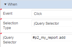
Create a new dynamic action that will respond to button press, using on click of a jQuery selector.


Use the following selector to identify add button clicks on your report.
#p2_my_report .add

Add an action to execute the following JavaScript. It sets the page item with the value of the ID set in the data tag.
$s('P2_ADD', $(this.triggeringElement).data('id'));

Don't forget to set this to not Fire on Page Load. this.triggeringElement represents the button pressed, which is generated as the following HTML.
<a href="javascript:void(0);" 
   data-id="7900" 
   class="add t-Button t-Button--warning t-Button--simple t-Button--stretch">Add</a>


Other JavaScript options

If other information was required, you could define more data tags, or traverse the DOM to find other values in the row. For IR you would need to first define static ID for the column as SAL. Classic reports automatically use the column alias.
$(this.triggeringElement).closest('tr').find('td[headers=SAL]').text()

If you were defining a remove function, then a second statement could be added to immediately hide the row from view without needing to refresh the report by locating the surrounding tr tag.
$(this.triggeringElement).closest('tr').hide();
Though this may make pagination feel a little strange, as the number of rows displayed won't add up.

Or you could add a declarative true action to hide the triggering element, so the button can't be double clicked by a frustrated user.

Partial Page Refresh

May 2017 - I've added this section in response to a reader comment. I can't believe I neglected this property in the first place.

You'll find a problem if the report is refreshed due to a range of actions such re-sorting, applying filter, or perhaps invoked as a refresh action in yet another dynamic action - the on click dynamic action on our action button no longer works!

This is easily adjusted using the Event Scope property for the on click dynamic action, using the 'Dynamic' option (formerly 'Live').

Set Dynamic Action Event Scope to Dynamic

This maps to a jQuery setting that, as the item help describes:
Binds the event handler to the triggering element(s) for the lifetime of the current page, irrespective of any triggering elements being recreated via Partial Page Refresh (PPR).
The default option is static perhaps as the lowest common denominator, favouring speed. Most reports would have this adjusted to Dynamic.

The second property allows you to define the surrounding container of what's being refreshed, ie, the region. It's my understanding that you would include the following value.
#p2_my_report

And this would reduce the search area required to find our particular buttons, but I thought that was the purpose of supplying this as a surrounding ID/repeating class combination.

Execute the PL/SQL

You could then define a second action that executes PL/SQL, including P2_ADD in 'Page Items to Submit', so you can then refer to :P2_ADD as a bind variable in the PL/SQL. Note, you should always explicitly convert any value from session state that is not a string.


Alternatively, you could define an onChange event on P2_ADD which does the same thing. This would allow different UI on the page to invoke the same action.


The onChange dynamic action should only execute when the item is not null, and an action after the PL/SQL should clear the item. This allows the same value to be selected successively, otherwise the value wouldn't 'change' the second time around.
In the screenshot & example below I also refresh the region containing the collection.

Outcome

So that describes a pattern I use frequently, and some variation of which is asked on the forums all the time. I plan to extend this example to include the collection report as a modal dialog with the ability to add & remove.


Run the demo to see it in action.


If you want to explore this further, you might like my book on jQuery with APEX. </shameless-plug>

Tuesday, 22 April 2014

Adding CSS buttons to your report

I've liked this concept ever since I saw the packaged applications use this technique:


I've finally gotten around to posting this in part due to some feedback on my sample application.

Edit May 2018
It's still a great concept, but the Universal Theme allows you to just reference existing classes. Check out an example here.

I used Chrome's inspect element tool to extract the CSS required to create this effect.
According to my notes I first did this when the Bug Tracking application used Theme 24.

You can then modify this to suit your requirements. I've changed the buttons from orange to green in my sample application. You can also change the size of the buttons using the last three attributes (highlighted) - something I've done to suit people's fingers tapping the screen in tablet based applications .

a.uButton.uButtonGreen {
  border: 1px solid #55a955;
  border-bottom: 1px solid #55a955;
  background: #55a955;
}
a.uButton.uButtonGreen span {
  background-color: #e6f0e6;
  background-color: #e6f0e6;
  filter: progid:DXImageTransform.Microsoft.Gradient(GradientType=0, startColorstr='#e6fae6', endColorstr='#e6f0e6');
  -ms-filter: "progid:DXImageTransform.Microsoft.gradient(startColorstr='#e6fae6', endColorstr='#e6f0e6')";
  background-image: -webkit-gradient(linear, 50% 0%, 50% 100%, color-stop(0%, #e6fae6), color-stop(100%, #e6f0e6));
  background-image: -webkit-linear-gradient(#e6fae6,#e6f0e6);
  background-image: -moz-linear-gradient(#e6fae6,#e6f0e6);
  background-image: linear-gradient(#e6fae6,#e6f0e6);
  color: #404040;
  text-shadow: 0 1px 0 rgba(255,255,255,0.75);
  -webkit-box-shadow: 0 1px 0 rgba(255,255,255,0.5) inset;
  -moz-box-shadow: 0 1px 0 rgba(255,255,255,0.5) inset;
  box-shadow: 0 1px 0 rgba(255,255,255,0.5) inset;
  padding-bottom:10px;
  padding-top:10px;
  width:85px;
}
You could also rename the classes to help prevent clashes with existing usage.

You can place this CSS within the "Inline" CSS page attributes, or more appropriately in your own CSS file that you would place in your images folder, perhaps in /i/themes/my_app/custom/ or uploaded to your APEX workspace.
Some define their own custom virtual path /c/ in the application server.

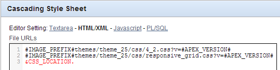
You would then include this file in your application from within your page template, conveniently highlighted in red below.
CSS referenced in Page Template

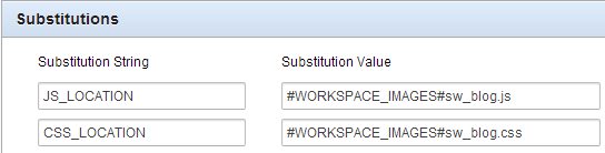
In this case I defined a substitution string in my application properties, that way I only need to define the location once and refer to it in a number of templates.
Shared Components -> Application properties

Now in every report you wish to use the classes you apply the following properties to the link column.
The link text could reference data from the report using the #COLUMN# syntax
<span>#ID#</span>
And the link attributes tag the span with the class you wish to reference.
class="uButton uButtonGreen"

These link attributes are a powerful tool, I use them frequently in conjunction with dynamic actions using jQuery selectors.

Have fun!

Monday, 18 March 2013

User friendly APEX date items

Back in my Oracle Forms days, we had a library function associated with our date fields that accepted a value of "t", which then returned today's date.

We had further variations on this, but I thought I'd see how I'd go at implementing this in the APEX environment.

Update - included .change() to invoke trigger
http://stackoverflow.com/questions/8437125/jquery-invoke-change-without-user-action-but-by-val-change

First, well, second after creating some date fields on my page - I defined a dynamic action "t in date"
Event: Key release
Selection type: jQuery Selector
jQuery Selector: .hasDatepicker -- this is a class automatically assigned to my dates, found simply with right-click -> Inspect element in Chrome
Condition: equal to
Value: t

Dynamic Action definition
You only require a true action, executing some JavaScript
$(this.triggeringElement).val(return_date('-')).change();
In my case I used a function to return a date formatted nicely for my Oracle environment - more details below.
Don't fire on page load, and set "Selection Type" to "Triggering Element"
JavaScript action
I must thank Tobias in the OTN forums for to return date function, but I've extended it a little to suit my tastes.
I also added a parameter so I could define another DA that accepts "y" for yesterday - and adjust my call to return_date('-',-1)

function return_date(p_delimiter, p_offset) {
  /* with help from
   https://forums.oracle.com/forums/thread.jspa?threadID=2186734
   http://stackoverflow.com/questions/894860/set-a-default-parameter-value-for-a-javascript-function
  */
  /* Default delimiter to . */
  p_delimiter = typeof p_delimiter !== 'undefined' ? p_delimiter : '.';
  p_offset    = typeof p_offset    !== 'undefined' ? p_offset : 0;

  /* Create date object */
  var myDate = new Date(Date.now());
  myDate.setDate(myDate.getDate()+p_offset);

  /* Create output string DD.MM.YYYY */
  /* Day */
  var myStr = (myDate.getDate() < 10 ? "0" + myDate.getDate().toString() : myDate.getDate().toString()) +  p_delimiter;
  /* Month */
      myStr = myStr + (myDate.getMonth()+1 < 10 ? "0" + (myDate.getMonth()+1).toString() : (myDate.getMonth()+1).toString()) + p_delimiter;
  /* Year */
      myStr = myStr + myDate.getFullYear().toString();

  /* Set value */
    return myStr;
}
Note how much more difficult it seems to default parameters in JavaScript compared to PL/SQL.

What do you think? The only problem I've found is if you tab quick enough after typing "t", the trigger does not fire.
Oh, and IE8 seems to have a problem with the date constructor - but I've all but lost my patience pandering to IE.

An example can be found here:
http://apex.oracle.com/pls/apex/f?p=SWESLEY_FORUM:6:0::NO::P6_MODE:E

Scott

Wednesday, 13 July 2011

Modifying your APEX login page

If you would like your Login (101) screen looking a little more exciting, add a picture to paint a thousand words.

Update: You may be looking modify your APEX workspace login page. 
http://www.grassroots-oracle.com/2013/02/modifying-apex-workspace-login-page.html
or
http://www.oracle-and-apex.com/customize-the-apex-workspace-login-page/

Today I added a little polish to one of our sample applications, and I thought I'd share the relatively simple process.
As with all things Oracle, there are many ways to skin this... er, vegetable. The simplest is to edit the region properties for the container holding the username/password fields.
Here I added a region image definition of
#APP_IMAGES#sage_logo.gif
which referred to an image I've loaded into the Apex repository.

On a side note, it may be a good idea to parameterise the image location, but that's another story.

Alternatively, I could have added a Display Image item; modified the region source; added some pre-element text... I could go on, but this solution placed the image in a place that suited my imagination exactly.

Part of this decision was not fighting the product. Apex isn't always great at complying with your WYSIWYG thoughts, sometimes it's not worth spending 80% of the effort on manipulating layout.

I also thought the default width for the form region was excessively wide, so I thought I'd investigate where to change that. I wasn't exactly sure what this theme did, so I needed to look underneath the hood.

I'm a regular Chrome user, so out of the box I could right-click on something in my page and select "Inspect Element."
I happened to right-click in the table that houses my items, so I kept looking at the parent divs until I saw the width: 450px definition. Next to that is a link that names the CSS file that sets that attribute, so I opened that file; modified the value from 640 to 450, and refreshed my page to a nice ratio.


A simple task, hope it helps.

Scott