First impressions
Too much dead space (a bugbear of mine), but some key improvements should outweigh what can be fixed or adjusted.I'm sure I'll get used to the new navigation & layout, but there does seem like some ambiguous double ups exist, eg: Content tab
Note: forums are now 'spaces', and threads are 'discussions'.
With my APEX hat on, it took me a while to find the 'Application Express' space from the home page - it's under 'Database', not 'Development tools' - which I probably would have known if I didn't always bookmark my forums - thankfully those still work, even though you can't open old URLs that include the forumID.
Turns out there is a search region hidden at the bottom of the page.
https://forums.oracle.com/forums/thread.jspa?forumID=137&threadID=2546249
https://forums.oracle.com/message/11060390
Basically you can open up old URLs without the forumID - which thankfully means google search results are re-routed
The biggest gripe
This seems to be the list of forum posts is what I might call the IR Detail style, meaning you only see a handful of discussions per page scroll, rather than dozens. I wish there was an option to toggle between views styles.I thought by maybe 'Following' the Application Express space might make these posts appear in my Content->Following option, but alas - I'm yet to discover what this does or if it works.
As I tidy this post from some initial notes, it seems that the Overview tab for the space is too verbose, while the Content tab shows a view more to my liking - except the first half of the screen is wasted on chaff.
The search appears to be more effective - but I always used to search using Google anyway.
New discussion
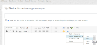
Start of a new discussion shows how great the new editor is, various ways to make your postings pretty. |
| New discussion |
Will be annoying to use that menu to set syntax, I hope there will be a shortcut like {code}. I saw /pre mentioned somewhere at one point, some people have been asking for a brief manual which I'm sure will be forthcoming with updated FAQ that is easy for newcombers to locate.
Ability to add tables to posts wil probably be nifty, too.
Marking responses
I don't have any responses to give helpful/correct answers, but that functionality appears to have been consolidated and should be a lot easier to interpret, more intuitive and should encourage newer users of forum to indicate what's going on.At the moment thought it seems you can reward yourself with correct answers. This may help some complaints of missing/extra points, which will be looked at. At the moment it seems missing points due to old threads that were always marked for deletion. My theory for extra points are for unrewarded single responses to answered questions. I think I'm about 150-200 points up, and this seems like a fair guess.
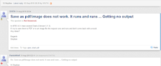
Layout of discussions are nicer, softened, contemporary. The syntax highlighting is great!
Reply a lot better, just some fanciness that opens a text area on the bottom of the page, making it a lot easier to reference older information |
| New layout |
Account settings
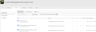
Existing bio information is mostly gone, just your name and status level, with a nearby legend. You are supposed to be able to add it back in Edit Profile (drop down near your name), but I haven't yet been able to save this.There is a message on the home page regarding known issues, and you can find your old posts under Browse->Content->Participated
 |
| Posts related to you |
I think this shows the value of simple, row by row reports - though it has an option to change to a view that merges 'iconic' with discussion text and quicklinks.
Avatar can be changed in the Activity tab for your account, but only to list of icons (for now). Other Preferences changed here also.
Having Friends also allows you to use the @ sign to make them aware of posts.
The Tasks tab option is currently disabled, although you will get emails regarding action items (when you get friends) that take you to the main 'Task List'. More ambiguity.
Speaking of ambiguity - the content is different depending on if you come from main Browse tab; account detail or the Space you're in - for instance I can see 'Jive Genius' option via the Browse tab..
Conclusion
I think it has been worth the wait, and we always expected some people to be happy/unhappy - so give Sonya & the team some kudos for some very hard work and be patient while the wrinkles are ironed out.Scott


No comments:
Post a Comment