
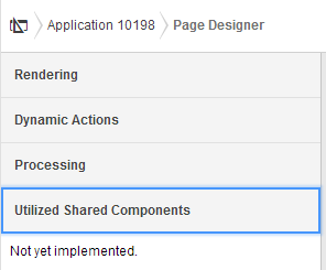
I won't go into the designer itself because David Peake covers that well in his video - but some of the other things I noticed before watching David's videos. I will say, however, in addition to all this you'll find yourself using wizards a lot less
Moving around
If you start playing with property attribute values you'll find when it comes to moving between components & pages, we now have a warning for any unsaved changes. There have certainly been a few times when I wonder if I'm going crazy thinking - did I save? Now I'll know.
By the way - you can check out people's feedback on the early adopter so far. I've put in a suggestion to potentially see a list of the outstanding changes we may have forgotten about, or wondering if we can ignore them all.
https://apexea.oracle.com/pls/apex/f?p=4840:5:0::NO:5:P5_ID:275492489463389040
Developer Action Bar
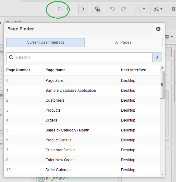
In regard to navigation options, this has probably undergone the most noticable change - I certainly spend a lot of time up there, pressing edit page or opening shared components - or typing a page number in the search widget. |
| APEX 4.2 action bar |
The new action panel currently has two distinctly different modes. The minimal toolbar shows the core options - on icons who's meaning we'll have to re-learn. (I hate learning new icons)
Amusingly (for me) the shared components icon is a triangle, circle & square - the original name of my blog. I also find it vaguely reminiscent of the old Electronic Arts logo.
Unfortunately the page number search doesn't allow entry when in the minimal mode - I presume this is just an early adopter bug.

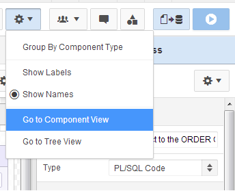
History conserved
For those like me who might like to occasionally find safety in the refuge of the past, you can find the 4.x Tree View and the 3.x Component View under the cog settings icon - which has been commandeered from shared components.I've been laughed at on Twitter in the past for enjoying the use of the Component View, but I do appreciate & think it's right that the development team kept it in.
 |
| APEX 5 settings menu |
 |
| APEX 4.2 rendering icons |
So I feelthis combined with the Page Designer's new accordion shows they got the options balance pretty good. Dynamic actions certainly deserve their own category.
 |
| APEX 5 Page Designer Accordion |
| APEX 5 EA navigation bar |
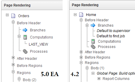 |
| Tree View has extra spacing |
The rest of the the development environment has stayed pretty much the same - albeit with flatted UI.
The Application list; Shared Components; Utilities; Administration; SQL Workshop; Team Development - all have not fundamentally changed.
Popups
Anyone who used APEX 3.x can attest that date picker popups were annoying.
In 4.x bigger I think popup windows could use a little jQuery treatment
In 4.x bigger I think popup windows could use a little jQuery treatment
 |
| APEX 4.2 page find |
 |
| APEX 5 modal dialog |
For further detail on using modals for your own applications, check out a post by Joni at iAdvise.
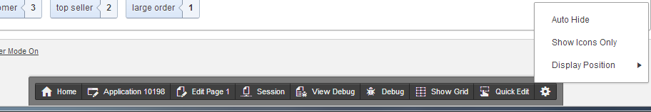
Runtime Developer Toolbar
Last century it was about saving keystrokes, today it's about saving mouse clicks.
If I had a dollar for every time I did this...

<a href="f?p=4000:RUN_PAGE:15746635751085:BRANCH_TO_PAGE_ACCEPT:::FB_FLOW_PAGE_ID,FB_FLOW_ID:0,10198" class="launch-aut">And at runtime you'll noticed the toolbar has been enhanced once again. For a start it doesn't take up the entire page width and has an option to auto-hide.
| APEX 4.2 runtime |
 |
| APEX 5 EA runtime |
The new Quick Edit feature replaces the Show Edit Links option. Now it greys out the runtime page and offers you to point a crosshairs cursor at an item or region - it will then jump back to the browser window with your application builder then highlight and open the properties component you select - cool!
 |
| Quick Edit |
No comments:
Post a Comment