Showing posts with label CSS. Show all posts

Sunday, 15 March 2020

Inspect Element Deep Dive, with Oracle APEX

In my previous post about tweaking APEX classic reports, most of the settings were "low-code" configurations. All except the final line of JavaScript that moved the radio group from its default location, to the region's title bar where we'd normally find buttons.

But how did I conjure that statement?

When I wrote my book on jQuery in APEX, my general premise was each web page can be queried like a database can, you've just got to learn how to apply the filters to find the relevant component.

Browser Tools


In most browsers, if you right-click on any component on the page, then choose 'Inspect Element', you'll see a window appear showing you what the web page looks like prior to markup.

I can also use F12 in Chrome on my laptop to bring up this console window, but don't presume that's the same anywhere - I borrowed a laptop for a webinar once, and it put the laptop in aeroplane mode. I digress... you can dock this console window to the bottom, side, or have it floating elsewhere.

Where is my item?

If I inspect the radio group, it will take me to the specific radio option, in this case 'Accounting'.

As I move the mouse up the tree, different portions of the page will highlight, signifying exactly what part of the page the HTML represents. Sometimes you'll also see orange & green, signifying margin & padding respectively.

Find the relevant component on the page with help from highlighting

I kept going until I found the P29_DEPT_Z_CONTAINER, which holds all of the contents of my radio group item P29_DEPT_Z. The id property allows us to 'query' this page using the filter (selector) #P29_DEPT_Z_CONTAINER.

I can wrap this selector with the $() function to return that portion of the page, a portion I would like to move somewhere else.

You can also see what happens when you enter this in the console window - it returns a result.
$('#P29_DEPT_Z_CONTAINER')

What function do I use?


I use this jQuery cheatsheet to help identify the relevant command I need. Sometimes there's alternates depending on what expression is on either side of the equation.

In this case, I want to take my radio group, and append it to somewhere else on the page.
$('the object I want to move').appendTo('where it is going');

Where is it going?


The next step is to identify the part of the page where my snippet of HTML will be going.

I can use the same inspect element technique to locate a region already dedicated to placing buttons.

Find the destination using the same technique

Here I've located my zhuzh region by the Static ID I've applied (purple), and there is a div the represents the location of the buttons. I can identify this part using one of the classes (red)

Classes are prefixed with a dot when used within selectors
.t-Region-headerItems--buttons

You need to take care when determining which selector to use. IDs should be unique (but aren't necessarily), and classes certainly aren't unique.

A pairing of ID and class is often an effective combination, but you need choose the right class. One you've added your own is often safe, and you can inject classes into the page using various APEX attributes. They can be anything.

This t-Region set of classes is defined within the Universal Theme. One early problem with APEX was these classes would change from theme to theme, as we didn't have a universal theme, so migrating custom code could be awkward.

The UT has changed some classes over time, but documented ones should remain constant.

Verifying the selector


Using the find function in the Elements tab allows you to test your selector, test how many results are returned on the page. If I just use the class, I actually get two results - one for each standard region I have on the page.

Count components on the page by searching in element tab

Combining these selectors will ensure I only get the button class for the relevant region. This is what forms my destination selector in the appendTo().

Testing the move


We can test the final command in the Console tab of the browser tools.

$('#P29_DEPT_Z_CONTAINER').appendTo('#zhuzh .t-Region-headerItems--buttons')

If I test this without using the #id selector, then the radio HTML will be appended to both regions.

Test your command within the runtime page

Once you're happy with the result, you can add it to the relevant portion of your page. In this case, I put it in the page attributes 'Execute on Page Load', though often it's within a dynamic action.

Playing with CSS


While we're here, it would be remiss of me to mention how you can play with the CSS attributes in the browser tools.

Play with styling on the rendered page

In this example I found the background colour property of the radio group label, and turned it green.

This was done without re-rendering the page, but it's only relevant until I do re-render the page, just like when we applied the console command to move the radio group.

But it's a great way to test/tweak CSS commands to see the result before applying it as CSS content rendered with the rest of your page.

The syntax would be similar, we would take a selector, but in the same syntax as what's found in the Styles sub-tab. You can copy/paste from the tab if you're not sure.

.t-Region-headerItems--title {color : red}

This CSS in the page would apply the styling during render of all page markup, but we could also do this on demand with jQuery, with just a slight adjustment to the syntax - and this is but one variation.
$('.t-Region-headerItems--title').css('color', 'red');

Conclusion


These concepts can arm you with some nifty behaviours, above and beyond what comes with APEX.

Or to think of it a different way, if can really empower your use of dynamic actions, as the same instruments can be wielded as a jQuery selector, dynamic action condition, part of set value action, to name a few.

Doing this with an Interactive Report also provided extra challenges.

See a video on how to action this blog here, and the app here.

Happy APEXing!

Monday, 26 August 2019

Oracle APEX Radio Group null option fix

APEX 5.1 introduced a template option that transformed radio groups into pill buttons.


I love this concept, it makes for a pleasant UI - an easier target for mouse clicks and finger taps.
I liked it so much I tried to do this myself prior to 5.1.

In 18.2 (fixed in 19.1), there's an issue with the way the null option presents for these radio groups - it's not in the same row.


Marko mentions a CSS fix for this problem in his post, but I find it has some side effects.
.apex-item-grid.radio_group{
  display:flex;
}
Stretched items are no longer stretched, and it ignores the Number of Columns attribute.


I went to inspect the generated HTML, and compare it to the 19.1 working solution, expecting to find some difference in CSS, but I quickly realised the null options is just generated in the wrong level on the tree.

You can also test this manually by using the in the browser tool to drag/drop that element to its siblings in the grid-row.


This means the problem can be solved with JavaScript when the page loads.
$('.apex-item-grid > .apex-item-option').each(function(){
  $(this).prependTo($(this).next('.apex-item-grid-row'));
});
This JavaScript identifies any radio options that are immediately below the grid, instead of being within the grid-row. Then for each instance, it moves that element to the next sibling, which is the grid-row.


Using appendTo() will push it to the end of the list.

And this solution honours the stretch option.


Is there a better way?
Other than upgrade to 19.x ;p

References

jQuery Cheatsheet

Wednesday, 24 April 2019

Highlight 'current' card in APEX

Earlier today I posted a solution that required a bit of jQuery to execute after refresh of a report.

Avoiding post-processing is always nice, so here's an example that is resolved during render.

I would like to highlight the 'current' card in this classic report:

Cards Classic Report

The SQL that dynamically defines these cards includes the following column, with some decider over which record is deemed the current selection.
,case when :P17_ITEM = 'SOMETHING' then 'is-active ' end AS card_modifiers
Then we can include some CSS relevant to that card group, identified here by Static ID 'my_cards_r'.
#my_cards_r .t-Cards-item.is-active div.t-Card
  {background-color : green;}
This solution should also reflect appropriately after any refresh of the card region.
If you define a declarative List region, it also uses the is-active class when the list entry is current, so this CSS could also apply.

This is different to the #CARD_COLOR# substitution string, that drives the colour of the circles where your icon/initials are.
Here I used:
,'u-color-12' card_color
Do you have a preferred solution?

Wednesday, 5 September 2018

Client Side Dynamic Actions using jQuery Selectors

Consider a data entry page where it might be nice to capitalise the first letter of a person's name, for a number of fields.


I understand I may be anglicising a problem that contains minutia, but focus instead on the thought processes and options we have available using Dynamic Actions.

Let's say we want to create a dynamic action that responds to change on any of those name fields, then runs some JavaScript to apply sentence-case to the name value, before the user submits the page.

We can do this declaratively just using the mouse, APEX will construct a comma delimited list for you as you select page items from the list.

Declarative item selection

But that's not the only way we can nominate components on a web page. The example above might create a selector for those items that is a comma delimited list of IDs.

$('P18_FIRST_NAME,#P18_MIDDLE_NAME,#P18_LAST_NAME');

When we have a look at the underlying HTML defined for these items using Inspect Element, the selector would locate these fields based on the id="P18_FIRST_NAME"

Inspect Element to see underlying details of page components


Alternatively, we could use classes. This is how web developers of any ilk build their web pages. They make up a string that means something to them, then associate some behaviour with it.
You don't need to "define" a class anywhere, but it pays to ensure it's unique, and follows a standard.

In our case, if we could add a class to each item, then we would only need to list one class in the dynamic action.
In some circumstances, this style of coupling behaviour could be more advantageous.

To make "initcap" appear as a class, as shown in the item as highlighted above, add the string to the 'CSS Classes' in the Advanced section of the item properties.


APEX Page Builder makes this task quicker, thanks to behaviour inspired by Oracle Forms - well, some of us ex-Forms programmers will recognise it as such.

If you select multiple items, you can change some properties in bulk.


Over in the properties, we can modify CSS Classes attribute for all three items at once.

Multi-item select in Page Designer

Note the 'Value Placeholder' attribute - this is different for each field, so the delta symbol is shown with the attribute value blued-out. I love this concept.

So back on the dynamic action, we can change the 'Selection Type' to jQuery Selector, and reference the class with the relevant syntax - prefixed with a full-stop, as opposed to the hashtag for IDs.

.initcap

Dynamic action, only when item value all lower case

We also didn't want this behaviour to apply only when all the letters are still lower-case. If the user wants to enter "von Braun", I won't overwrite their particular usage.

So note the client-side condition, emphasis on the 'client'. Most conditions on APEX components are server-side, which generally means they are evaluated during page render - do we or do we not include this button/region/item? Dynamic actions have client side conditions to decide whether to apply the True actions, or the False actions.

$(this.triggeringElement).val().toLowerCase() == $(this.triggeringElement).val()

Here I've referred to the item being triggered using this.triggeringElement, mentioned in the inline help for this particular attribute. Wrapping that expression with $().val() gives me the item value, or I could have used apex.item().getValue. jQuery built in .toLowerCase() does what you would hopefully infer.

As with all things programming, there are many ways to cook an egg, and this goes for setting the value. Here I've define a Set Value action that uses a JavaScript Expression, as there is no need for a round trip to the database server.

True Action - apply change to item value

This expression uses a function I found on Stack Overflow that I was happy with

toProperCase($(this.triggeringElement).val())

I placed in an application level JavaScript file, included via User Interface attributes of the application.
// Turn mcdonald into McDonald
// only run/apply if current string lowercase
// $(this.triggeringElement).val().toLowerCase() == $(this.triggeringElement).val()
function toProperCase(s)
{
  return s.toLowerCase().replace( /\b((m)(a?c))?(\w)/g,
          function($1, $2, $3, $4, $5) { if($2){return $3.toUpperCase()+$4+$5.toUpperCase();} return $1.toUpperCase(); });
}
Most of the JavaScript usage I have in my applications these days tend to be one line, or is some form of expression, so commonly used there is only a small handful.

Don't let a little JavaScript scare you away from enabling useful interactivity for the end user. Dynamic actions do most of the work for you :p

Monday, 7 August 2017

APEX Login Background Image Cover

For a while I've wanted to play with cover photos on login pages, and when Keegan asked a similar question on Twitter, I was curious enough to ultimately have a play.

Someone mentioned relevant a reference to CSS-Tricks Perfect Full Page Background Image, but after quickly finding the video Keegan must have screenshotted in her tweet, I realised us APEX developers need to use the following instead of 'html' as our selector.
.t-PageBody--login

Update for APEX 19.2: Days after I had a discussion about limiting the references to Universal Theme (UT) classes, particularly nested ones. I find that my original extended reference of .t-PageBody--login .t-Body is no longer valid in 19.2 UT.
As Peter suggested, it would be great to have a set of release notes to supplement the living document that is apex.oracle.com/ut.
I possibly wouldn't expect this particular example to be itemised, but knowing where to look would be great.

Plugin extraordinaire Daniel suggests
using 16:9 1920x1080 for standard UT use css media queries for different screen sizes with a pool of 2 / 3 images
The example I applied uses a CSS media query to not use a background image for smaller screens, as it may look too busy.
<style>
@media (min-width:400px)  { /* anything but mobile */
  .t-PageBody--login .t-Body {
    background: url(#IMAGE_PREFIX#cover_images/&P101_IMAGE.) no-repeat center center fixed;
    -webkit-background-size: cover;
    -moz-background-size: cover;
    -o-background-size: cover;
    background-size: cover;
  }
}
</style>
I defined this CSS within a region so I could apply a 'dev only' build option. Alternatively, this could be a PL/SQL region, with the code abstracted/encapsulated within a PL/SQL package, possibly utilising the htp package.

Style within Region
This also means the image location and file name are easily parameterised. So your images could be located anywhere, and you could programmatically decide which image to display. And/or use media queries to determine which image should display on the relevant device.

As an experiment, I wondered if I could rotate through a number of images, so each time someone visited the login page, they would see one image from a pool of many. So I defined an item with the following calculation:
'beauty'||floor(dbms_random.value(1,8))||'.jpg'

We can confirm an evenly distributed calculation by running that computation many times and counting the results.
select count(*), val from (
  select floor(dbms_random.value(1,8)) val
  from dual connect by level < 10000
) group by val

COUNT(*) VAL
1413  1
1445  6
1412  2
1420  5
1411  4
1415  3
1483  7
This would randomly select from a small suite of photos in the folder. I've used a selection I've collected from APOD.


And voila, an inspirational login page.

APEX Login with background cover image
I think an improvement would be to show a consistent image while attempting to login. A brief experiment suggests only running the computation when P101_IMAGE is null, and only clearing login fields (not the entire page cache) during page processing.

This could be the final bling you need after pimping your login page.

Don't forget, you can style the backend login, too.

Once again, thank you #orclapex community for making this a breeze.

Wednesday, 14 June 2017

Presentation: Dynamic Actions, Javascript, & CSS for APEX Beginners

My first webinar didn't do so well, perhaps my new home will have suitable internet capability, in this "innovate nation" of ours...

My second one on my Boggex game went ok, though the room the locals were in was like an sauna.

My third attempt had it's own set of issues.
1) Ubuntu as an OS doesn't seem to enable broadcasting via GoTo Meeting.
2) The wireless policy in the Oracle building is effective, but not great for hastily setting up a second laptop
3) The navigation keys on Lino's keyboard was just different enough to be disruptive
4) While I use on Chrome's save password feature, I'm pretty confident with most of my APEX passwords. It's the username I was stuffing up on the foreign PC.
5) The think tank at HP thought it would be a good idea to map Aeroplane Mode to F12, so when I proceeded to display the Chrome browser console...

So balance was restored after the first 10 or 15 minutes, which rattled my first attempt at presenting using just an APEX app - no powerpoint/prezi.

Though I think the concept was fine. It's just like training people, jumping between Page Designer and runtime.

I'd give it another go, and it's less presentation prep. I learned a bit from the first session, and explored some layout options while I was at it.

I still baulk a little at the difference between talking with a live crowd, and a community of ears at the other end of my microphone. I wonder if (finally) creating a few more videos will fix that? Once my ultrabook is back from computer hospital, perhaps. In the new house?

As for the topic, I explored dynamic actions, JavaScript and CSS for those trying to understand the fundamentals. It's a favourite topic of mine and I think there are a few basic patterns that get me a long way in creating interactive applications.

No doubt I'll refine these example further, and how to communicate them more concisely. Stay tuned.

I've made the app available here. Please feel free to provide any feedback, either here or through the app.
https://apex.oracle.com/pls/apex/f?p=27882
My favourite page is P50 specifically on Dynamic Actions, probably the most versatile utility within APEX.
If you scroll down you'll see the relevant code I used to sustain an interactive page that doesn't need to submit.
Also look out for things like conditional buttons, conditional colours (foreground and background), APEX behaviour considerations, among others.

If you're in Australia and you'd like training on this topic, I could demonstrate cool stuff for hours ;p
I also aim to get some organisation around github sorted when I get my laptop back, but I've at least put the export here so you can check it out directly.
https://github.com/swesley/apex-beginner-css-jquery

I hope you learn something new.

Scott

Monday, 13 March 2017

Font APEX between versions

Sometimes, it's the little things in an application that make users happy.


Sometimes, it's just the icon on a darn button, card, or menu that makes all the difference.


Surely by now you've encountered using icons within Oracle APEX, and we've come a long way since Theme 25. To get anyone up to speed, APEX 5.0 saw the introduction of Font Awesome baked into the builder, which is a reputable CSS icon library for such things.

5.1 vs 5.0
As with other 'plugins', Font Awesome library releases new versions with new icons at a different schedule to APEX releases. It's easy to get your 5.0 instance up to speed with the latest library, thanks to Patrick's simple write-up.

Now the same goes for the 1000+ icons that come with Font APEX, some of them database specific which for some reason excites me a little. If you need to catch up, Dick Dral has a great low down on what makes Font APEX awesome, so to speak, and for those who are familiar with Dick's work, that's a double down on word play - see his URL of his sample application, which is growing to quite a utility.

But if you would like to use the latest library, or even use it within APEX 5.0, Max Tremblay gave us this great post. It's a little more involved than Patrick's, but things aren't as easy.

The long snapshot of menu icons shows the difference between 5.1 on the left, and 5.0 on the right. They've cleaner, they scale better, and we can no doubt all thank Shakeeb.

Max provided some CSS that's required to suit adjust usage to Font APEX, but having an app with icons found all over the place, I encountered some other components that needed adjustment. With some further back & forth on the APEX slack channel, Max helped me come up with these.
/* Font APEX 
CSS required to make Font APEX from 5.1 work in 5.0
Headstart provided by Max Tremblay
https://max-tremblay.blogspot.com.au/2017/02/using-font-apex-in-apex-50.html
*/

/* Most icons around the place */
.t-Icon[class*=' fa-'],.t-Icon[class^=fa-]{
    font-family: font-apex!important;
    font-size: initial;
}

/* Left side menu */
.t-TreeNav .a-TreeView-node--topLevel>.a-TreeView-content .fa{
    font-size: initial;
}

/* Left side sub menu */
#t_TreeNav ul ul .a-TreeView-content .fa {
    font-size: 12px;
    padding: 10px 0;
}

/* Navbar dropdown */
.t-NavigationBar-menu .a-Menu-content .a-Menu-item .fa {
    font-size: 12px;
}

/* Navbar top row */
.t-NavigationBar-item span.t-Icon {
    padding-right: 5px;
    padding-top: 0px;
    font-size: 14px;
}

/* Slide tooltip plugin */
.a-DetailedContentList-icon {
    padding-top: 10px;
}

/* Custom icon usage within breadcrumb */
.t-Breadcrumb-label .fa {
  padding-top: 3px; 
}
I think this once again shows the versatility APEX has between versions, quite literally replacing one plugin with another, with a little help from the community.

#letswreckthistogether

Wednesday, 25 May 2016

More on CSS selector performance in Oracle APEX

Last month I wrote a post about CSS performance, including some performance test results.

I recently encountered this brilliant post on Medium that describes some best practices for CSS.

While APEX does a lot of this for you, I think it's worth a read by all developers. Even applying basic naming conventions can make code easier to read and understand.

There was also a section on performance that described an issue that my previous example didn't explore, and that's 'tree walking'. Each web page could be likened to a giant tree, and your CPU will like you if you can minimise the amount of traversing necessary to verify the component being sought.

So for APEX developers, consider the selector reading right to left, and try keep it to two steps.

For instance, to identify a button within a classic report, you would define a static region ID for the report, and use the following selector
#p1_region a.t-Button

This would look for anchors with the standard Universal Theme button class, but only if it exists within the classic report region. Concise & effective.

You could use this selector to apply further CSS attributes to the buttons, perhaps via the Inline CSS page attribute.
#p1_region a.t-Button { font-weight : bold; }

Or you could use it as a jQuery selector for an on-click Dynamic Action, responding to the button press. If you add the following as link attributes to the column with the link button. It adds an attribute to the anchor with information from a column aliased as season in your SQL.
data-season="#SEASON#"
Note, to render a column link as a button, this attribute would also contain this class listing, to look like the nearby image.
class="t-Button t-Button--warning t-Button--simple t-Button--large t-Button--stretch"

You can refer to this information within a JavaScript action to set a hidden page item with the data from the season column.
$s('P1_SEASON', $(this.triggeringElement).data('season'));

A subsequent PL/SQL action could then submit this value to session state and execute something related on the database, without submitting the page on click of the report row button.

While that has side tracked from selector performance, it shows how a simple selector can be used within APEX to trigger events. A pattern I use regularly, done with minimum effort.

If you like this post, you may like my book /plug

Thursday, 28 April 2016

On CSS/jQuery Selector Performance

My post describing the use of a simple selector identifying page spinners was originally going to be about performance, then I learned something I found very interesting.

I likened what I learned to Tom Kyte's essay (Asktom->Resources->Presentations->FalseKnowledge.htm) on Correlation vs Causation. The essence was that things change over time, and we can't always trust authorities on the topic, and we must always test in our own environments. This aligns with skepticism in general, and here we are applying it to web development.

The following forum post described the subsequent code
https://community.oracle.com/thread/3908020
.u-Processing
{
display:none
}
I was going to suggest simply prefixing the provide class with the relevant HTML tag.
span.u-Processing
{
  display:none;
}
But I discovered a thing or two while drafting the post to explain my reasoning.

A while ago I incorporated much of my jQuery performance knowledge from this article
http://www.artzstudio.com/2009/04/jquery-performance-rules/
It was concise and it made sense. It also harmonised with other information I found on the topic. However, the post is now 7 years old and is probably worth re-testing it's assertions.

Consider the provided solution using .u-Processing. The period prefix means it's looking for a component on the page with the class u-Processing, as per in the definition of the spinner.
<span class="u-Processing" ...

If the component had an id, you could use the # prefix to reference the ID, much like using an unique* index. (*in the web world, the an ID is not guaranteed unique, but should be in best practice, particularly to avoid logic errors.)

As I had previously interpreted, the problem was that it needs to look at every single component on the page. If the selector was prefixed with the span, this reduces the workload on the browser by filtering the DOM tree to just the span tags.
span.u-Processing
And of those span tags, which have the provided class.

The reasoning seems sound, right? Part of it relates to native JavaScript methods available for locating content. Now if only there was a way to test these assertions...

Well on jsperf.com you can set up such test cases and run them against different browsers. Similar websites are available for SQL (livesql.oracle.com) and JavaScript test cases (jsfiddle.net).

[Note: jsperf.com was alive when I started drafting this post in March 2016, but has been down for a few weeks in April? ]

In regard to browser performance, someone had already prepared an example based on the performance rules described.
https://jsperf.com/jquery-class-vs-tag-qualfied-class-selector/47
And the results on my laptop in 2016 painted a somewhat different picture.

Chrome / Linux / Laptop

And true to Tom's essay, when I tried the same tests across different browsers on a different platform, the results are widespread.


But like anything it really depends on the page you're running it on. I did find the test case a little contrived since it was based on a very small portion of HTML, so I attempted the same type of test using HTML extracted from a typical page generated from APEX to see how many entries it's actually sifting through.

http://jsperf.com/apex-tag-vs-id-vs-class


To give you a sense of scale, I ran some jQuery statements in the browser console of an even bigger page, one including a region selector so plenty of regions & reports.

This returns the number of elements on the page you could identity with a jQuery selector. In my case it returned about 3000.
$('*').length

There are only 148 spans.
$('span').length

And only one spinner.
$('.u-Processing-spinner')

Considering the amount of operations/second the browsers are capable of, these numbers may seem small, but everything adds up. It's worth keeping up with better practices to trim performance where ever possible.

So the lesson I read out of this is if your developing APEX applications and you have basic jQuery mechanics, or even just use jQuery selectors in your dynamic actions, then perhaps stick with a readable, logical option that you're comfortable with.

Either that or I still have a lot to learn about jQuery performance ;p

If anyone has good, current resource recommendations on the topic, I'd be happy to hear. Particularly if it relates to use in the #orclapex environment.

Wednesday, 23 March 2016

About CSS Selectors

Recently I saw a simple, accepted answer in the forums that tempted me to provide a small extension to the provided answer. This has since spawned two blog post ideas, here is the first (here is the second).

Background

The following question asked how to hide the spinner from a particular page full of small reports refreshed on a timer.
https://community.oracle.com/thread/3908020
The answer was some basic CSS, which could be placed in a variety of locations depending on desired scope.
.u-Processing 
{ 
display:none 
}

The answer is clear, but doesn't show any working. I'm sure many people out there would like to know how to arrive at that answer themselves.

About CSS

If you don't really know what the above code really means, let's start with the basics. CSS allows you to identify an element on a web page, then change one of it's attributes. The selector identifies the component, and the attributes are listed within the brackets. The described example identifies the processing spinner and hides it, but how do we build the relevant syntax ourselves?

I think CSS selectors can be likened to queries against the database. You want to identify a specific component, then change it.

You can invoke the spinner in order to identify it. A function is described in the Oracle APEX API Reference, which can be invoked on demand in your own applications.

You can try this on the login page to apex.oracle.com by opening the browser console window (usually F12) and typing
apex.util.showSpinner()


Invoke the spinner on any APEX page from the browser console
The spinner will display and you will also see output relating to the component itself. If you right click on the spinner and Inspect Element (Chrome et al) you can see more details about the component and what properties it currently has.


You can modify these properties directly and immediately see their impact on the page. You can un-check attributes to disable them, or change their value, often from a discrete list of option. Sizes can be increased/decreased with the arrow keys. I do this all the time to test sizes.

A good reference for these attributes can be found here
https://developer.mozilla.org/en-US/docs/Web/CSS/Reference

Using Selectors

You can identify the spinner using a variety of selector expressions, just like you could find a particular record in the database using a variety of where clauses. Bear in mind some will work faster than others.

Consider the provided solution using .u-Processing. The period prefix means it's looking for a component on the page with the class u-Processing, as per in the definition of the spinner.
<span class="u-Processing" ...

Note I'm referring to the parent span of the .u-Processing-spinner that's highlighted in the image. Setting this to display none will only hide the spinning icon, not the surrounding shaded circle.

If the component had an id, you could use the # prefix to reference the ID, much like using an unique* index.
(*in the web world, the an ID is not guaranteed unique, but should be in best practice)

The element tab can help in determining the required selector. The strip at the bottom shows the path, a form of which can also be retrieved by right-clicking the parent span in the HTML code and selecting 'Copy CSS path' (or Copy Selector, depending on browser version), which may provide a more 'specific' selector, but not necessarily what you need or what.

The spinner may be in different locations on the page depending on context. Performance is another issue, but that's for the next post.
Specificity is important since any given component on the web page could have attributes from a variety of sources, so there is a precedence called CSS Specificity.


Getting what you need

The selector doesn't need to be complicated, just specific. Try it out by either searching for the selector in the code window, or seeing what it returns in a jQuery command entered in the console.
eg:
$('.u-Processing')

Look for a class or ID on the web component you want to manipulate, test out it's uniqueness (so you don't hide anything you shouldn't).

.u-Processing

Then add the attributes you want to set within brackets, multiple attributes are separated by semi-colon.

.u-Processing { display : none; }

This code could then be placed anywhere within APEX that accepts Inline CSS, such as the page attribute. Or it could live in a .css file and associated with your applications.

Want More?

If you want more examples of what you can do with CSS and jQuery in APEX, you may consider my book, jQuery with Oracle APEX. </shameless_plug>

Wednesday, 11 March 2015

Adjusting Interactive Reports - learning from mistakes

Sometimes I come across code where it's obvious someone has taught themselves APEX, then worked through a problem to come up with a solution - but they went a long way.

Today's situation required data in an interactive report to not wrap the output. I thought it'd be worth sharing because a few lessons might be demonstrated along the way for newer developers.

Here is the long way:


1) Add this to the Page Load property
$('td').attr("style","white-space:nowrap");
This will work to a point, until the user start filtering the IR. And it affects all td page elements, not just those in the report.

So now the developer (name withheld to protect the innocent) does the following:
2) Create a hidden item P1_IR_ID

3) Create on new instance computation to fetch the allocated report ID
SELECT interactive_report_id
FROM apex_application_page_ir
WHERE application_id = :APP_ID
AND   page_id        = :APP_PAGE_ID
The computation point will rarely fire because this is executed typically upon landing on the login page - at least the first APEX page visited before logon.

4) Create a dynamic action to reapply the original jQuery.
Event: After refresh
Selection type: DOM Object
DOM Object: &P1_IR_ID.

With a JavaScript action has per the page load. The dynamic action scope was Dynamic to ensure it was reapplied after any partial page refresh (PPR), but I think this would be superfluous to an "after refesh" event.

I admire the ingenuity here to identifying the report. This would have been easier solved with a static region ID being allocated to the region, eg: p1_report, then using jQuery selector #p1_report.

Here's the easy way.

Define the following CSS, either inline or within your supporting .css file.
.ir_nowrap td {
  white-space:nowrap
}

Add "ir_no_wrap" to the region's CSS classes.
Done.

However, my theme 25 IR template did require an additional adjustment, because I found the original template had two class attributes, and the second one was ignored and my class wasn't being used.

I changed the first line from this"
<section class="uIRRegion" id="#REGION_STATIC_ID#" #REGION_ATTRIBUTES# class="#REGION_CSS_CLASSES#">
to this:
<section class="uIRRegion #REGION_CSS_CLASSES#" id="#REGION_STATIC_ID#" #REGION_ATTRIBUTES#>

If you like this sort of example to learn from, then I bet you'll enjoy Peter's (coming) APEX Worst Practices presentation.

Friday, 25 July 2014

APEX Printer Friendliness using CSS Media Queries

In the projects I've been involved with I've rarely seen it used, but there is a ninth argument in the f?p= syntax that toggles Printer Friendly mode.

Side note - being the space geek I am this reminded me of the hubhub over Pluto being the ninth planet.

The APEX documentation on Printer Friendly mode states
When referenced, the Application Express engine does not display tabs or navigation bars, and all items are displayed as text and not as form elements.
You also need to take care with the construction of your theme's Printer Friendly page template to help make this happen. This template is included in the theme by default and should have the namely template class.

However, there is another method you may like to consider to prepare your pages for printing - without needing to re-open the page - CSS Media Queries.

Here I have a print button on a demo page which invokes the browser's printer dialog box using window.print();

Basic report with Print button
Trouble is all my menus and sidebars are included in the print preview.

Printer preview including expanded menu / sidebar

CSS Media Queries aren't just for making your website respond to the gamit of screen sizes that exist, but also allow you to interrogate the media type. We can use this to identify components on our page that should not be displayed when printed.
@media print {
  #navwrap, #blog_posts, #p31_detail, #p31_notes, .uButton
 ,.noPrint
    {display:none;}
}
You could either identify the page components in the CSS media query - here I've identified my menu bar, side bars, second region at the bottom of the page and any buttons.

Alternatively you could apply a class to all components you don't want printed - eg: .noPrint.

The HTML shown in the print preview is now much cleaner when I click the printer button.

This HTML document is ready to kill a tree

Of course if you have various form elements you may still want to consider a combination of media queries and the use of the Printer Friendly mode. While looking for documentation links I also stumbled across this example by Andrew Tulley.

Run the demo to see it in action.
Try view the print dialog before pressing the 'Apply Media Query' button

There is a more comprehensive breakdown on how to action this for UT here by Sandro
https://www.sotful.com/sandroferreira-blog/quickest-print-friendly-in-oracle-apex

References

CSS Media Queries
W3Schools Media Type
APEX Documentation - Printer Friendly mode
Grassroots Oracle - f?p syntax mnemonic
Andy's Blog - hybrid example
Smashing Magazine - tips and tricks for print style sheets

Thursday, 29 May 2014

Enhancing APEX "no data found" message

Truth be told, the default "no data found" message for APEX reports is pretty boring.

Out of the box

Even the default wording irritates me just a little bit every time I see one amidst a page I thought was looking pretty snazzy.


There are two things I've done recently to make it look a little better.

1) Surround it with a nice soft coloured box.

Something with a little pop

This is pretty simple, just add the following CSS to your page (Edit page properties -> Inline CSS) or application's .css file. Tweak it to your heart's content - just no blinking text, please.

span.nodatafound {
  font-size:120% !important;
  border: 1px solid #FC0;
  background: #FFC;
  color: #384F34;
  display: block;
  font-weight: bold;
  margin: 2px auto 14px;
  padding: 15px !important;
  text-align: left;
}

2) Customise the output

Speaking of cats (if you clicked through the reference), there are probably a few ways to skin this one.

If you create a dynamic action the fires after refresh of your report region, you can execute this JavaScript

var ndf;
switch($v('P4_REPORT_SEARCH').length)
{
case 1:
  ndf="One character and you found no records?!";break;
case 2:
  ndf="Make sure there is no type";break;
default:
  ndf="No employees by this name, sorry.";
}

$('span.nodatafound').text(ndf);

And that's it!
See a demonstration on this sample search page.
Note it refreshes the report on key release.
Try type letters not found in the emp table.

Tuesday, 22 April 2014

Adding CSS buttons to your report

I've liked this concept ever since I saw the packaged applications use this technique:


I've finally gotten around to posting this in part due to some feedback on my sample application.

Edit May 2018
It's still a great concept, but the Universal Theme allows you to just reference existing classes. Check out an example here.

I used Chrome's inspect element tool to extract the CSS required to create this effect.
According to my notes I first did this when the Bug Tracking application used Theme 24.

You can then modify this to suit your requirements. I've changed the buttons from orange to green in my sample application. You can also change the size of the buttons using the last three attributes (highlighted) - something I've done to suit people's fingers tapping the screen in tablet based applications .

a.uButton.uButtonGreen {
  border: 1px solid #55a955;
  border-bottom: 1px solid #55a955;
  background: #55a955;
}
a.uButton.uButtonGreen span {
  background-color: #e6f0e6;
  background-color: #e6f0e6;
  filter: progid:DXImageTransform.Microsoft.Gradient(GradientType=0, startColorstr='#e6fae6', endColorstr='#e6f0e6');
  -ms-filter: "progid:DXImageTransform.Microsoft.gradient(startColorstr='#e6fae6', endColorstr='#e6f0e6')";
  background-image: -webkit-gradient(linear, 50% 0%, 50% 100%, color-stop(0%, #e6fae6), color-stop(100%, #e6f0e6));
  background-image: -webkit-linear-gradient(#e6fae6,#e6f0e6);
  background-image: -moz-linear-gradient(#e6fae6,#e6f0e6);
  background-image: linear-gradient(#e6fae6,#e6f0e6);
  color: #404040;
  text-shadow: 0 1px 0 rgba(255,255,255,0.75);
  -webkit-box-shadow: 0 1px 0 rgba(255,255,255,0.5) inset;
  -moz-box-shadow: 0 1px 0 rgba(255,255,255,0.5) inset;
  box-shadow: 0 1px 0 rgba(255,255,255,0.5) inset;
  padding-bottom:10px;
  padding-top:10px;
  width:85px;
}
You could also rename the classes to help prevent clashes with existing usage.

You can place this CSS within the "Inline" CSS page attributes, or more appropriately in your own CSS file that you would place in your images folder, perhaps in /i/themes/my_app/custom/ or uploaded to your APEX workspace.
Some define their own custom virtual path /c/ in the application server.

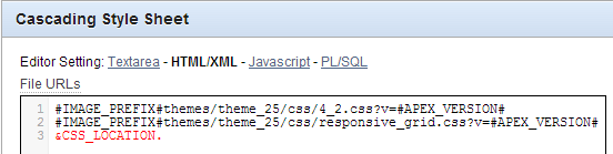
You would then include this file in your application from within your page template, conveniently highlighted in red below.
CSS referenced in Page Template

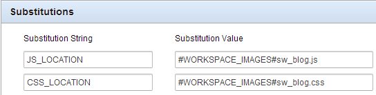
In this case I defined a substitution string in my application properties, that way I only need to define the location once and refer to it in a number of templates.
Shared Components -> Application properties

Now in every report you wish to use the classes you apply the following properties to the link column.
The link text could reference data from the report using the #COLUMN# syntax
<span>#ID#</span>
And the link attributes tag the span with the class you wish to reference.
class="uButton uButtonGreen"

These link attributes are a powerful tool, I use them frequently in conjunction with dynamic actions using jQuery selectors.

Have fun!

Friday, 7 June 2013

Highlight cell background in APEX report

It seems a very common question in APEX is how do you highlight the background of cells within reports?

There is a heap of information out there, and some of it is becoming dated so I thought I'd offer what seems to be an elegant solution - particularly when you're not targeting a specific column.

We can thank Tyler Muth for an APEX 3.x compatible solution that highlights the text within the column. He described how to use the HTML Expression column attribute - I still use this frequently today.

There are a few solutions that use report templates, but they can be a little fiddly and I don't find them as flexible.

Jari Laine brings us into the APEX 4.x world using jQuery within a dynamic action.

Then I found this stackoverflow post by Tom Petrus (who has also assisted me with jQuery on the OTN forums), which I thought I could adapt for my purposes.

Since I wanted to highlight cells with certain values regardless of column/row, I defined a classic report with a static ID of 'pivot' with the PIVOT sql found in this post.

I added this to the "Execute when Page Loads" page attribute - it could utilised within a dynamic action, if required.
$("#report_pivot tbody tr td").each(function(){
   if ($(this).attr('headers') != 'TOT') {
     if (parseInt($(this).text()) < 1000)
        $(this).css({"background-color":"SandyBrown"});
     else if(parseInt($(this).text()) > 2000)
        $(this).css({"background-color":"lightgreen"});
   }
});
I wanted to ignore the 'Total' column, so I found the first IF statement satisfies that easier than a CSS exclusion clause.
This block could be adapted to do all sorts of things - for instance, I've cleared out the cells in other reports where the value equals 100.

I also added this as inline CSS just to border all the report cells.
table.uReportStandard>tbody>tr>td {
  border: 1px solid #ddd;
}
Here is a screenshot of the final output.
Classic Report with cell highlighting

Run the demo to see it in action.
Note all under 1000 are orange, and above 2000 are green.
This is done after the page is generated.

Wednesday, 8 May 2013

Freezing the Navbar Menu plugin to top of page

Recently I blogged about a nifty CSS only menu that is a great alternative to the horrible APEX tab-sets. Unfortunately I had to ditch it for a recent project because it didn't work well on touch screen devices, so I picked up Enkitec's Navbar plugin instead.

I wanted to freeze the menu at the top of the page, so when the user scrolled down, the menu would remain at the top of the screen.
I tried doing this some time ago with a side-bar menu but came across a bunch of problems - this time round it required very little CSS to make it happen. This stackoverflow post suggested 2 lines, but my APEX example extended a touch more:
.navbar {
  position:fixed;
  width:100%;
  z-index:10000;
}
.apex_span_12, .apex_span_10 {
  margin-top:50px;
}
The key is the position fixed, width 100%, but the fixed position had some minor side effects - some objects overlapped my menu, and all existing content shifted up underneath the menu.

To fix the overlap I used z-index, which is the third dimension beyond height/width and decides which components appear above another when the position is set. I added a large z-index value so the menu always overlapped other objects I had such as a google map, CSS checkbox switches and other maps that by default went over the menu instead of under like all the APEX components.

Then I had to make sure all my regular content started underneath the menu, so this is where the margin comes in. Since I was using the responsive Theme 25, I identified those classes as the lowest common denominator for moving my content.

Depending on the page template used, it was either of those classes - basically if I had a side-bar region the apex_span_n changed. I'm happy to receive feedback on a smarter solution, but this worked for me.

I used 50 pixels, but the font in my menu is at 130% to benefit bigger fingers on the touch screen.

Hope it helps!

Scott

Wednesday, 1 May 2013

CSS pull down menu using APEX List

I find APEX tab sets cause all sorts of issues in applications, either through management or behaviour. A common request is to create some pull-down menus as a replacement.
There are plenty of options for this, including a number of jQuery plugins, but here is an example that uses only CSS
http://www.lwis.net/free-css-drop-down-menu/ultimate.horizontal.html
This makes it lightweight and fast.

It's easy to implement this as a list template in APEX, enabling you to source your menu from a SQL query (possibly on your page meta-data) or a static list.

You might have seen this in the past as a Sumneva presentation from Scott Spendolini, which somehow I found after encountering the LWIS site - but it did confirm a few gaps for me. It also provides a good review of Tabs vs jQuery vs CSS.

I personally had a few issues implementing this as described, but I think there are some minor bugs during the rendering if list templates.
The following example renders it fine.

Upload supporting files

Upload the following files to your workspace - downloadable here under MIT/GNU licence.
default.css
default.ultimate.css
dropdown.css

Or place them in your fileserver - whichever is appropriate.
You'll also need these images (in this example, anyway)
grad1.png
grad2.png
nav-arrow-down.png
Note no JavaScript files required.

Create list template

Create new list template from scratch (don't be scared!)

Name: CSS Horizontal Dropdown Menu
Class: Pull Down Menu or Custom n -- either would be worthwhile

Once created, edit the template and enter the following in the relevant locations, or download the template export from here and adjust the supporting file locations accordingly.

Before List Entry
"List template before rows"
Here you'll need to modify the CSS location as appropriate. In fact when loading things into the APEX workspace, default.css also needs to be included here and the @import command removed from default.ultimate.css
Likewise, the CSS needs to be modified so all the supporting images are referenced using something like
background-image: url(http://www.lwis.net/free-css-drop-down-menu/images/default/nav-arrow-down.png);
unless you come to other arrangements.
<link href="#WORKSPACE_IMAGES#default.css" media="screen" rel="stylesheet" type="text/css" />
<link href="#WORKSPACE_IMAGES#dropdown.css" media="screen" rel="stylesheet" type="text/css" />
<link href="#WORKSPACE_IMAGES#default.ultimate.css" media="screen" rel="stylesheet" type="text/css" />
<div id="navwrap">
<ul id="nav" class="dropdown dropdown-horizontal" style="margin-bottom:10px;">


<style> 
ul {
  list-style-type: none;
}

#navwrap {
  float:left;
  width:100%;
  margin-bottom:4px;
  background:#f6f6f6;
  border-style:solid;
  border-color:#d9d9d9 #d9d9d9 #d9d9d9;
  border-width:1px 1px 1px 0;
}

</style>

This also includes an override for the user agent stylesheet for unordered lists, otherwise you see bullet points instead of images.
The navwrap ID settings pushes the menu across the width of the page.

Template Definition
"List template current"
<li><a href="#LINK#">#TEXT#</a></li>

"List template current with sublist items"
<li><a style="color:black;" class="dir">#TEXT#</a><ul>

"List template non current"
<li><a href="#LINK#">#TEXT#</a></li>

"List template noncurrent with sublist items"
<li><a style="color:black;" class="dir">#TEXT#</a><ul>

Before Sublist Entry
"Sublist template before rows"
<!-- I don't believe this renders with dynamic lists!
this is why the opening UL is in the definitions above -->


Sublist Entry
"Sublist template current"
<li><a href="#LINK#">#TEXT#</a></li>

"Sublist template current with sublist items"
<li><a href="#LINK#" class="dir">#TEXT#</a>

"Sublist template noncurrent"
<li><a href="#LINK#">#TEXT#</a></li>

"Sublist template noncurrent with sublist items"
<li><a href="#LINK#" class="dir">#TEXT#</a>

After Sublist Entry
"Sublist template after rows"
</ul></li>

After List Entry
"List template after rows"
 </li></ul></div>

Prepare menu hierarchy

Before defining the region that renders the list, you need a list defined - this will be your hierarchical menu. This way it can either be a static list where you manually define the menu options, or it could be a query over your application's meta-data.

In this example I'll use a dynamic query - but before creating your list, we need to prepare the hierarchy.

I defined a few Page Groups to be my menu headings, and the allocated pages will live under the relevant drop down.
Application Builder -> Utilities -> Cross page utilities -> Page groups
Page group allocation

Create List 

Now we've prepared the meta-data, we can create a list based on a query that our list region will use.
The query is structure in three parts -
  • Home link - often identified by page alias of HOME, but you could get clever with this. 
Once I embedded this into the template itself, allowing me to parameterise a logo as the home link via substitution strings
<li >
  <a href="f?p=&APP_ID.:HOME:&SESSION." style="padding:0 5px;">
    <img src="&TEMPLATE_LOCATION.logo_&APP_ALIAS..png" style="max-height:26px;"/>
</a></li>   
  • Top menus - by default this are links, but I've modified these to just facilitate opening the menu - particularly for mobile devices where your finger is used instead of a mouse hover.
  • Drop down options - the destination pages for your menu
So create a new dynamic list from scratch called Menu. Use the following query
select -- Link to home page
   1        lvl
  ,page_name   label
  ,'f?p='||:APP_ID||':'||page_id||':'||:APP_SESSION||'::'||:DEBUG  target
  ,null  is_current_list_entry
  ,null  image
  ,null  image_attribute
  ,null  image_alt_attribute
  ,page_alias order1
from apex_application_pages ap
where application_id = :APP_ID
and page_alias = 'HOME' -- identify however you like
union all
select -- Menu options, don't link anywhere to aid touch devices
   1        lvl
  ,page_group_name label
  ,'#' target
  ,null  is_current_list_entry
  ,null  image
  ,null  image_attribute
  ,null  image_alt_attribute
  ,page_group_name order1
from apex_application_page_groups pg
where application_id = :APP_ID
union all
select -- drop down menu options - pages belonging to groups
   2        lvl
  ,page_title   label
  ,'f?p='||:APP_ID||':'||page_id||':'||:APP_SESSION||'::'||:DEBUG  target
  ,null  is_current_list_entry
  ,null  image
  ,null  image_attribute
  ,null  image_alt_attribute
  ,page_group order1
from apex_application_pages ap
where application_id = :APP_ID
and page_group is not null -- you may limit this to set groups, allowing further management of utility pages, popups etc
order by  order1, lvl,label
If you find the menu not displaying in the hierarchy you expected, check the order by. It should group results as you might translate to the menu - all the relevant menus together, and the top menu is the first record of each group.

Create list region

Create your global page (page zero) if you haven't done so already. This is the perfect place for your menu's list region.
Create a new list region in the global page, with the display point appropriate for your particular template. I chose region position 1. The region requires no template, but you use the List Template you just created.
You will also need to ensure the menu doesn't appear on pages that don't require it - logon, popups, etc. So make sure your region condition is appropriate. To start with it might be
:APP_PAGE_ID != 101

Remove tabs

Now that you have a CSS menu system in place, you can now remove the tab list that may have previously supported your pages. You might be able to make one change, depending on how you've managed your page templates. This could be modifying the Page template default in your current theme from "One Level Tabs" to "No Tabs". For the theme (2) I have been using in my sample application I also needed to remove the div that housed the tab set. 
CSS menu system
It's not quite as pretty as when implemented using one of the newer themes, but still looks neat and clean. I'll have to update this in future. You may also wish to replace the pixel style down arrows to something more contemporary, less retro.

Open my sample application and try out the lightweight, CSS only menu.
Does it work on your handheld device?

This biggest bugbear I have with this solution is it doesn't seem touch-screen friendly, despite my interpretation of assurances in the LWIS FAQ. While it drop's down, it doesn't allow me to select "Employees" using Chrome on my Samsung Galaxy III. On a Windows Latitude using IE, the drop-downs don't even open. First level selections are ok.

A similar alternative is an Enkitec plug-in incorporating the Twitter Bootstrap framework.

Scott

ps - a few weeks after I drafted this I noticed Dutch blogger Kees Vlek posting about the same framework.