I've put a call out on the OTN APEX forum asking for suggestions from the community on what they think are frequent APEX questions, be it within the forum or elsewhere.
In part, I'm chasing ideas for content in future presentations, or blog posts. I welcome others to do the same. I think if we share our perception of common questions, better resources will come.
So please, feel free to contribute in any way, shape, or form.
What questions do you see or hear all the time?
If for some bizarre reason you don't have an Oracle account for the OTN forum, just reply to this post, ... then register an account. It covers you for the forums, livesql.oracle.com, the Dev Gym, entitles you to download stuff like SQL Developer, and no doubt more.
Though probably no steak knives.

Wednesday, 29 March 2017

Make Radio Group look like UT Buttons
It's pretty easy to convert links in APEX reports to use the Universal Theme button look & feel, as I described here
http://www.grassroots-oracle.com/2015/12/tutorial-include-action-button-in-report.html
We can apply the same technique to radio groups, but it requires a little more work than just adding some classes, but nothing like jQuery mobile radio fiddles.
It took me a few goes to get the correct string in the correct APEX attribute to make the individual buttons look & behave the way I imagined, so I thought I'd share the journey. Show my working, so to speak.
First, create a radio item:
Then set 'Option HTML attributes' to add template option classes, just like I did for the report action buttons. This applies the string to each option, rather than the entire item.
If we check the page, the radio group should have button boxes surrounding the text labels.
To work out what CSS selector I needed to hide those radio buttons, I used Chrome's Inspect element tool (right click a radio button) so I can see how the HTML is constructed.
One shared property for each item is how the input tag has type=radio.
Further up you can see the entire fieldset as an id of P47_RADIO, our item.
Combine these to identify any radio buttons within this specific item.
Edit page 'Inline CSS' to using this combined CSS selector, with a property to hide any web component identified with that selector.
Edit: Commenter Yol had success with visibility:hidden instead of display:none, when it comes to submitting the values. This may be a browser dependent issue.
Hence I have also set position:absolute to ensure the radio buttons don't take up space, as per visibility attribute definition.
This tidies the button group, trouble is, the current selection is unknown without the native radio button. This can be solved by creating a dynamic action that toggles button classes upon click of each radio item.
Create dynamic action on click of jQuery selector
Add action to Execute JavaScript
Edit 2: I found that clicking in the green padding area did not change the radio selection, only when I clicked in the blue label. So I added the third line in the JavaScript to ensure the input value simulates the click event.

In my case the
Or "hotness", a highlight:
Or contrast, well, not highlighting the entire button:
All demonstrated in the button builder reference in the Universal Theme app.
You can achieve consistent button width by adding this to your Inline CSS:
After your page loads, you can use the inspect element tool and increase the width 'live', to find a figure/unit that works for you.
Now we need to ensure this selection is defaulted when the page opens. I prefer to execute the click() event as to simulate the actual action, as opposed to replicating the relevant addClass() function.
You can use a similar technique to conditionally hide a specific radio button in the group (though you still need to validate the availability to the user on the database end.)
Add this to your 'Execute when page loads' page attribute, instead of adding a Default Value the item itself.
Where the value=P represents the relevant radio item value. The .next() moves selection to the next sibling, which is the span element, where click is triggered.
Or you could consider this button group plugin.
Or in APEX 5.1 you can use the pill template option.
Or you could use some form of List template button group.
Or you can stick with tiny buttons only people using a mouse on a desktop PC can hope to aim for.
One of the beauties of Oracle APEX - so many options. I think I need to try convert this to a plugin.
Happy APEXing!
http://www.grassroots-oracle.com/2015/12/tutorial-include-action-button-in-report.html
We can apply the same technique to radio groups, but it requires a little more work than just adding some classes, but nothing like jQuery mobile radio fiddles.
It took me a few goes to get the correct string in the correct APEX attribute to make the individual buttons look & behave the way I imagined, so I thought I'd share the journey. Show my working, so to speak.
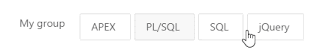
First, create a radio item:
 |
| A humble radio group |
Then set 'Option HTML attributes' to add template option classes, just like I did for the report action buttons. This applies the string to each option, rather than the entire item.
class="t-Button t-Button--simple"If we check the page, the radio group should have button boxes surrounding the text labels.
 |
| Radio group with button class |
To work out what CSS selector I needed to hide those radio buttons, I used Chrome's Inspect element tool (right click a radio button) so I can see how the HTML is constructed.
 |
| Inspect Element is the best browser tool. The best. |
One shared property for each item is how the input tag has type=radio.
Further up you can see the entire fieldset as an id of P47_RADIO, our item.
Combine these to identify any radio buttons within this specific item.
Edit page 'Inline CSS' to using this combined CSS selector, with a property to hide any web component identified with that selector.
#P47_RADIO input[type=radio] { visibility:hidden; position:absolute;}Edit: Commenter Yol had success with visibility:hidden instead of display:none, when it comes to submitting the values. This may be a browser dependent issue.
Hence I have also set position:absolute to ensure the radio buttons don't take up space, as per visibility attribute definition.
This tidies the button group, trouble is, the current selection is unknown without the native radio button. This can be solved by creating a dynamic action that toggles button classes upon click of each radio item.
Create dynamic action on click of jQuery selector
#P47_RADIO span.t-ButtonAdd action to Execute JavaScript
// add simple class to all options
$('#P47_RADIO span.t-Button').addClass('t-Button--simple');
// remove from current selection
$(this.triggeringElement).removeClass('t-Button--simple');
// Ensure underlying radio selected
$(this.triggeringElement).prev().click();
The result:
Edit 2: I found that clicking in the green padding area did not change the radio selection, only when I clicked in the blue label. So I added the third line in the JavaScript to ensure the input value simulates the click event.
In my case the
t-Button--simple template option is removed from the current selection, but you can play with these options to choose a combination that suits your desired contrast, using the various colours:t-Button--danger
t-Button--warning
t-Button--success
t-Button--primaryOr "hotness", a highlight:
t-Button--hotOr contrast, well, not highlighting the entire button:
t-Button--simpleAll demonstrated in the button builder reference in the Universal Theme app.
You can achieve consistent button width by adding this to your Inline CSS:
#P47_RADIO .t-Button {width: 100px;}After your page loads, you can use the inspect element tool and increase the width 'live', to find a figure/unit that works for you.
Now we need to ensure this selection is defaulted when the page opens. I prefer to execute the click() event as to simulate the actual action, as opposed to replicating the relevant addClass() function.
You can use a similar technique to conditionally hide a specific radio button in the group (though you still need to validate the availability to the user on the database end.)
Add this to your 'Execute when page loads' page attribute, instead of adding a Default Value the item itself.
$('#P47_RADIO input[value=P]').next().click()Where the value=P represents the relevant radio item value. The .next() moves selection to the next sibling, which is the span element, where click is triggered.
Or you could consider this button group plugin.
Or in APEX 5.1 you can use the pill template option.
Or you could use some form of List template button group.
Or you can stick with tiny buttons only people using a mouse on a desktop PC can hope to aim for.
One of the beauties of Oracle APEX - so many options. I think I need to try convert this to a plugin.
Happy APEXing!
Monday, 13 March 2017
Font APEX between versions
Sometimes, it's the little things in an application that make users happy.

Sometimes, it's just the icon on a darn button, card, or menu that makes all the difference.

Surely by now you've encountered using icons within Oracle APEX, and we've come a long way since Theme 25. To get anyone up to speed, APEX 5.0 saw the introduction of Font Awesome baked into the builder, which is a reputable CSS icon library for such things.
As with other 'plugins', Font Awesome library releases new versions with new icons at a different schedule to APEX releases. It's easy to get your 5.0 instance up to speed with the latest library, thanks to Patrick's simple write-up.
Now the same goes for the 1000+ icons that come with Font APEX, some of them database specific which for some reason excites me a little. If you need to catch up, Dick Dral has a great low down on what makes Font APEX awesome, so to speak, and for those who are familiar with Dick's work, that's a double down on word play - see his URL of his sample application, which is growing to quite a utility.
But if you would like to use the latest library, or even use it within APEX 5.0, Max Tremblay gave us this great post. It's a little more involved than Patrick's, but things aren't as easy.
The long snapshot of menu icons shows the difference between 5.1 on the left, and 5.0 on the right. They've cleaner, they scale better, and we can no doubt all thank Shakeeb.
Max provided some CSS that's required to suit adjust usage to Font APEX, but having an app with icons found all over the place, I encountered some other components that needed adjustment. With some further back & forth on the APEX slack channel, Max helped me come up with these.
#letswreckthistogether
Sometimes, it's just the icon on a darn button, card, or menu that makes all the difference.
Surely by now you've encountered using icons within Oracle APEX, and we've come a long way since Theme 25. To get anyone up to speed, APEX 5.0 saw the introduction of Font Awesome baked into the builder, which is a reputable CSS icon library for such things.
 |
| 5.1 vs 5.0 |
Now the same goes for the 1000+ icons that come with Font APEX, some of them database specific which for some reason excites me a little. If you need to catch up, Dick Dral has a great low down on what makes Font APEX awesome, so to speak, and for those who are familiar with Dick's work, that's a double down on word play - see his URL of his sample application, which is growing to quite a utility.
But if you would like to use the latest library, or even use it within APEX 5.0, Max Tremblay gave us this great post. It's a little more involved than Patrick's, but things aren't as easy.
The long snapshot of menu icons shows the difference between 5.1 on the left, and 5.0 on the right. They've cleaner, they scale better, and we can no doubt all thank Shakeeb.
Max provided some CSS that's required to suit adjust usage to Font APEX, but having an app with icons found all over the place, I encountered some other components that needed adjustment. With some further back & forth on the APEX slack channel, Max helped me come up with these.
/* Font APEX
CSS required to make Font APEX from 5.1 work in 5.0
Headstart provided by Max Tremblay
https://max-tremblay.blogspot.com.au/2017/02/using-font-apex-in-apex-50.html
*/

/* Most icons around the place */
.t-Icon[class*=' fa-'],.t-Icon[class^=fa-]{
    font-family: font-apex!important;
    font-size: initial;
}

/* Left side menu */
.t-TreeNav .a-TreeView-node--topLevel>.a-TreeView-content .fa{
    font-size: initial;
}

/* Left side sub menu */
#t_TreeNav ul ul .a-TreeView-content .fa {
    font-size: 12px;
    padding: 10px 0;
}

/* Navbar dropdown */
.t-NavigationBar-menu .a-Menu-content .a-Menu-item .fa {
    font-size: 12px;
}

/* Navbar top row */
.t-NavigationBar-item span.t-Icon {
    padding-right: 5px;
    padding-top: 0px;
    font-size: 14px;
}

/* Slide tooltip plugin */
.a-DetailedContentList-icon {
    padding-top: 10px;
}

/* Custom icon usage within breadcrumb */
.t-Breadcrumb-label .fa {
  padding-top: 3px;
}
I think this once again shows the versatility APEX has between versions, quite literally replacing one plugin with another, with a little help from the community.#letswreckthistogether
Subscribe to:
Comments (Atom)